
I Built An Entire Power BI Dashboard With Claude Code

Last month, I connected Claude Code to Power BI Desktop using a tool called pbi-cli, described what I wanted in plain English, and watched a fully formatted, measure-backed dashboard appear in about 10 minutes.
I did not open the formula editor. I did not drag a single visual. What surprised me most was not that it built the layout — it’s that it created the financial measures on its own, without being asked, because it figured out what the visuals needed.
And in this article, I am going to take you through the process I used to build a power BI dashboard with Claude Code step-by-step.
The Part of Power BI That Eats Most of Your Time
There are three separate layers of friction in any Power BI build.
The first is the visual layer: dragging in charts and cards, positioning them, resizing, binding the right fields, fixing the “can’t display the visual” errors when a binding is wrong. For a dashboard with 10 to 12 visuals, this takes 45 minutes on a good day.
The second is the measure layer: opening the formula editor, writing the calculation, remembering the syntax for DIVIDE, CALCULATE, and FILTER, validating the result, debugging when it returns blank. Finance professionals who aren’t deep into the tool avoid this layer entirely — which means their dashboards use raw fields instead of proper analytical measures.
The third is the formatting layer: clicking each visual one at a time, matching font sizes, getting the colors consistent, setting up conditional formatting for variance flags. This is the step that turns a working dashboard into a presentable one, and it takes just as long as the first two layers combined.
Multiply that across every report your team builds every month, and you have a significant amount of time going into output that should be infrastructure.
What Is PBI-CLI
pbi-cli is the connector that lets Claude Code interact directly with Power BI Desktop. It operates on two separate layers.
| Layer | What Claude Can Do |
|---|---|
| Report layer (PBIR JSON files on disk) | Create pages, add/edit/delete visuals, apply formatting, add conditional formatting |
| Semantic model layer (live connection via .NET TOM) | Create and validate measures, list tables and columns, read existing measures |
| What still requires manual work | Data modeling, source connections, relationship building, business logic decisions |
The reason the report layer works is the .pbip format. When you save a Power BI project as .pbip instead of .pbix, every visual is stored as its own JSON file on disk. Claude reads and writes those files directly, without going through Power BI’s interface. The .pbix format is a compressed binary, Claude cannot interact with it.
Setting Up Claude & Power BI
Why .pbip Format Matters
Before installing anything, open Power BI Desktop and save your project in .pbip format (File > Save As > choose the Power BI Project option). This is the step most people miss. Without it, the report layer tools don’t have anything to read or write.
Installing and Connecting
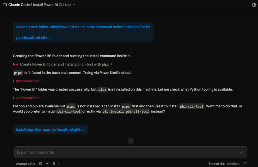
- Open a command prompt and run:
pipx install pbi-cli - Load the 12 pbi-cli skills into Claude Code:
pbi-cli skills install - Open your Power BI Desktop project in .pbip format
- Open the Claude desktop app — the pbi-cli tools are now available in the session
- Verify the connection by asking Claude to list the tables and measures in your semantic model
Key check: If Claude reads back your table names, column names, and any existing measures, the connection is live and you can build.
The verification prompt I use: “List all tables, columns, and existing measures in [YourProject] semantic model.” If it comes back with your schema, you’re connected.
Building the Finance Dashboard
The Prompt
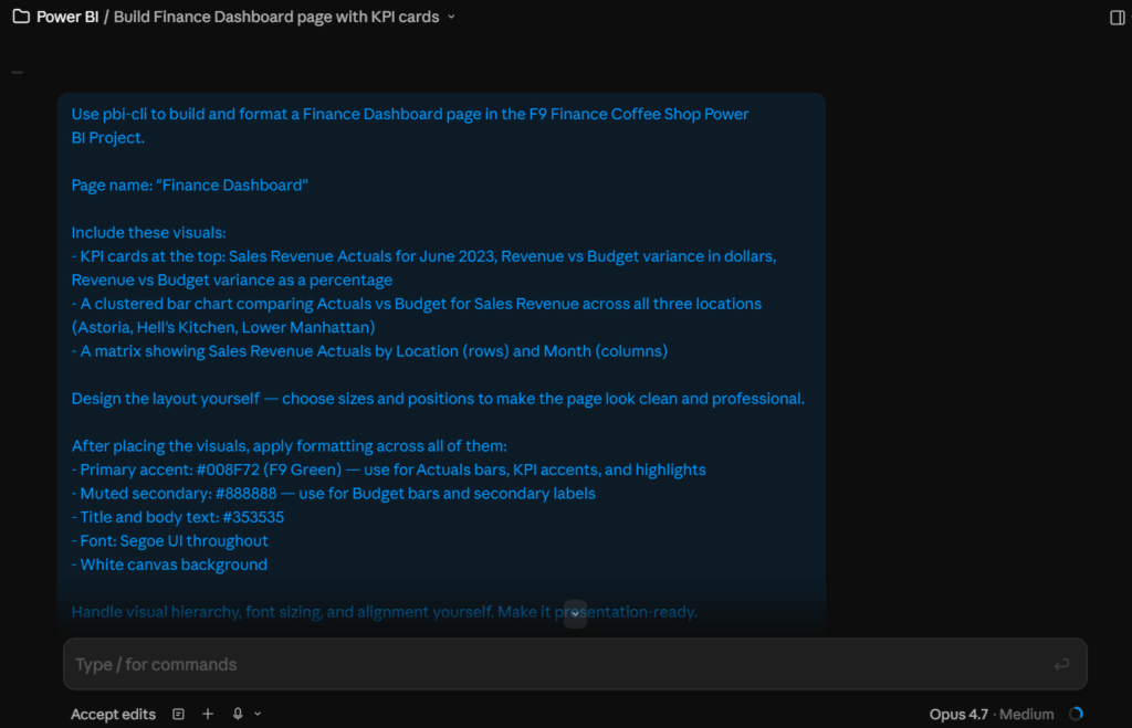
The prompt for the Finance Dashboard described what I wanted in plain English: KPI cards showing June 2023 performance (Revenue Actuals, Revenue vs Budget variance, and Gross Margin percentage), a clustered bar chart comparing Actuals vs Budget by location, and a matrix showing Revenue Actuals by location and month with conditional formatting to flag underperforming locations.
I specified colors (F9 Green #008F72 for primary accents, #888888 for secondary labels, #353535 for text) and asked Claude to design the layout itself. I did not mention measures, formulas, or specific visual dimensions.
What Claude Does With It
Before placing a single visual, Claude queried the semantic model to understand what fields existed. Then it created three measures it determined were needed: Revenue Variance $, Revenue Variance %, and Gross Margin %. It validated each one before moving to the next.
Here is the Revenue Variance % measure Claude wrote, unprompted:
Revenue Variance % =
DIVIDE(
    [Revenue Variance $],
    [Sales Revenue Budget],
    0
)
The DIVIDE function with a zero guard is the correct way to write this. Analysts writing quickly under time pressure skip it regularly, which produces blank KPI cards wherever Budget is zero. Claude wrote the guard without being asked because it understood what a correct financial measure looks like.
After the measures were validated, Claude designed the page layout, placed each visual, bound the new measures to the right cards, and applied the formatting — all in the same response.
The Dashboard That Came Back
Case Study: Coffee Shop Finance Dashboard
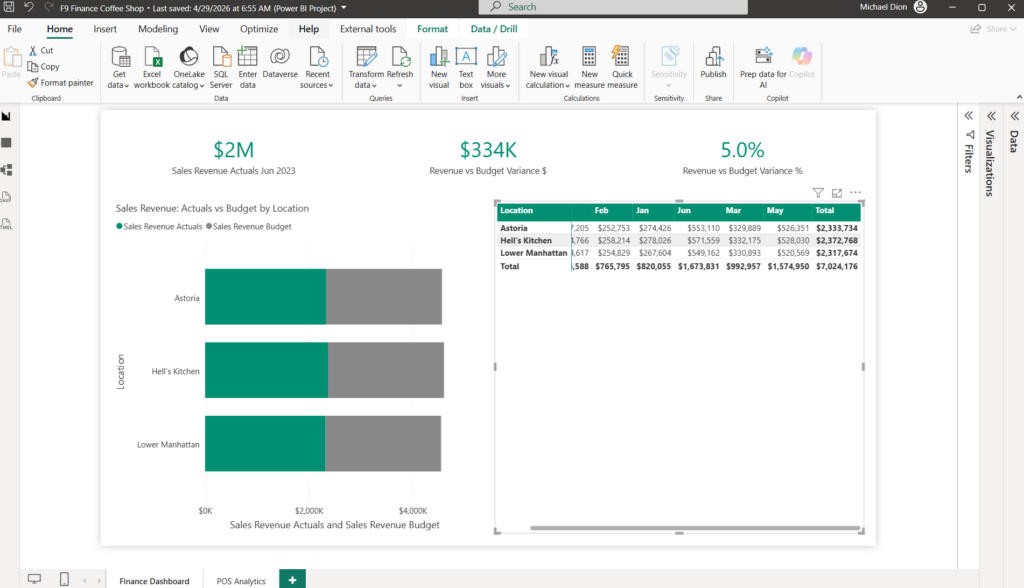
Situation: Blank report page, 216 rows of GL data for three Coffee Shop locations (Astoria, Hell’s Kitchen, Lower Manhattan), Actuals and Budget for six accounts across six months.
What changed: One prompt produced a formatted Finance Dashboard with three KPI cards, a budget vs. actual bar chart by location, and a location-by-month matrix with conditional formatting. Three financial measures were created in the semantic model without being requested.
Why it mattered: The field list had Revenue Variance $, Revenue Variance %, and Gross Margin % — all validated, all formatted correctly. The dashboard was ready to show to a CFO without any additional work.
The Measure Claude Wrote Without Being Asked
This is the part worth paying attention to. I described visuals. Claude inferred what analytical layer was needed to back those visuals up properly, then built it.
What this means in practice: Claude is not parsing keywords and dropping in generic measures. It’s reasoning about what a financially correct output requires. The Revenue Variance % includes an error guard. The Gross Margin % uses the correct numerator and denominator from the available fields. These are not defaults — they’re decisions.
For finance professionals who have avoided the formula editor because it felt like a different skill set, this changes the math. The barrier was never understanding what the measure should do — it was translating that into syntax. Claude handles the translation.
The One-Shot Build: 149,000 Rows, One Prompt
The Prompt
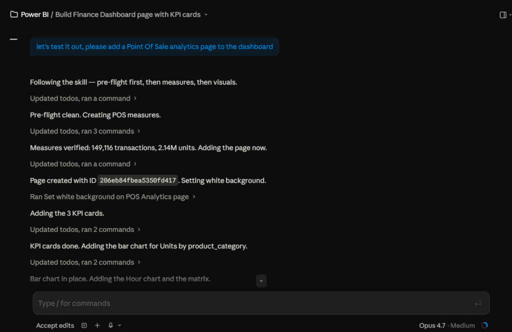
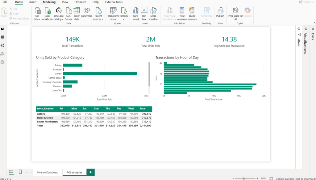
The second page used the Coffee Shop POS transaction dataset: 149,000 rows covering product category (Coffee, Tea, Drinking Chocolate, Bakery), store location, transaction time, hour of day, and quantity. I asked for five visuals (KPI cards, category bar chart, hour-of-day line chart, location comparison, and a top products table), brand formatting to match the Finance Dashboard, and told Claude to write whatever measures it needed.
What Claude Built
Claude created five measures in the semantic model (Total Transactions, Total Units Sold, Top Category by Transactions, transactions by category for slicing, and transactions by location for ranking), designed the page layout, placed all five visuals, and applied F9 brand formatting consistent with the Finance Dashboard — same colors, same fonts, same visual hierarchy.
The Insight That Came Out of It
The 7am peak.
The hour-of-day chart showed transaction volume peaking at 7am across Astoria, Hell’s Kitchen, and Lower Manhattan, then dropping sharply after 10am. That pattern was sitting inside 149,000 rows. It became visible because the chart was built to show it — but no one specified that it should look for a morning rush. Claude chose the right visual type and the right field binding to surface a real operational insight automatically.
That’s the difference between a tool that executes instructions and one that reasons about what the data should show.
What This Workflow Does Not Replace
Being direct about the limits matters here.
This workflow does not replace data modeling. Claude cannot build the relationships between tables, connect to source systems, or decide which tables belong in the model in the first place. That work is still yours.
It does not replace business judgment. Deciding what questions a dashboard should answer, what metrics matter to your CFO, which locations need more scrutiny — those decisions require context that lives outside the data. Claude builds what you describe. The thinking about what to build is yours.
What it does replace is the execution layer: the hours spent translating a clear idea into a formatted, functional report. That gap between “I know what I want” and “it exists in Power BI” is where this workflow operates.
How To Build Your Own Power BI Dashboard With Claude
What You Need Before You Start
- Power BI Desktop installed on Windows
- A project saved in .pbip format (not .pbix)
- pipx installed (standard Python tool installer)
- The Claude desktop app with a project configured
- pbi-cli installed and skills loaded
The First Prompt to Run
Start with the connection verification before attempting a build. This confirms everything is working before you commit to a full dashboard prompt:
List all tables, columns, and existing measures in [YourProjectName] semantic model.If that comes back with your schema, run a single-visual test next:
Add one KPI card to a new page called "Test" in [YourProjectName]. Bind it to
[YourMeasureOrColumn]. Validate after placing it.
If the card appears in Power BI Desktop correctly, you are ready to build at scale. Start with one page, one prompt, and iterate from there. The full dashboard prompts I used above are a good template once you have confirmed the connection is solid.
The setup takes about five minutes. The first dashboard takes about 10. After that, the time investment is mostly in deciding what to build — which is the part that was always worth your time anyway.