Excel Best Practices I Teach All My Analysts
Picture this: a colossal dataset, a tight deadline, and a looming presentation. Armed with a few key Excel best practices, I transformed a morass of numbers into a sleek, digestible presentation that not only impressed the powers that be but also saved my weekend from being buried in spreadsheets.
This isn’t just about avoiding embarrassing errors (though that’s a nice bonus); it’s about leveraging Microsoft Excel, a powerful data visualization and analysis tool, to its fullest potential.
Whether it’s about crafting complex formulas with ease, utilizing Excel functions like SUM and IF to automate tasks, creating dynamic visualizations that speak volumes, or just organizing data so you can actually find what you need without tearing your hair out—these best practices are your ticket to being the go-to guru in your office.
In this guide, I’m sharing the best practices I instill in every analyst I mentor. Consider this your cheat sheet to Excel mastery—because who doesn’t want to be the person who makes data look easy? Buckle up, because I’m about to turn you into an Excel powerhouse.
Preparation and Planning
Create a Scalable Excel Workbook
Creating a scalable Excel workbook is essential for efficient data management and analysis. A well-designed workbook can help you to easily organize, analyze, and visualize your data, making it easier to make informed decisions. To create a scalable Excel workbook, start by defining your goals and objectives. Identify the type of data you will be working with, the frequency of updates, and the number of users who will be accessing the workbook.
Next, plan your workbook structure. Divide your data into logical sections, such as input data, calculations, and output data. Use separate worksheets for each section to keep your data organized and easy to navigate. Consider using Excel tables to store your data, as they provide a flexible and scalable way to manage large datasets.
Finally, think about data validation and protection. Use data validation to ensure that users enter data in the correct format, and protect your workbook to prevent unauthorized changes. By creating a scalable Excel workbook, you can ensure that your data is accurate, up-to-date, and easily accessible.
Organize the Information Flow
Organizing the information flow in your Excel workbook is crucial for efficient data analysis and visualization. A well-organized workbook can help you to easily navigate and understand your data, making it easier to make informed decisions.
To organize the information flow in your workbook, start by creating a clear and consistent structure. Use separate worksheets for each section of your data, such as input data, calculations, and output data. Use column labels and row labels to identify your data, and consider using Excel tables to store your data.
Next, think about the flow of data through your workbook. Use formulas and functions to link your data together, and consider using pivot tables and charts to visualize your data. Use data validation and protection to ensure that users enter data in the correct format, and protect your workbook to prevent unauthorized changes.
Finally, consider using Excel’s built-in data tools, such as the Data Tools group, to help you organize and analyze your data. By organizing the information flow in your workbook, you can ensure that your data is accurate, up-to-date, and easily accessible.
Setting the Foundation: Data Organization
Trust me, the difference between a spreadsheet that works for you and one that feels like it’s plotting against you is how well you structure your data within an Excel worksheet. Using an Excel table can significantly enhance readability and performance by providing structured references and simplifying data manipulation. Think of it like arranging your garage—everything has its place, and you know exactly where to find the missing screwdriver when you need it.
Structuring Your Data
A well-structured spreadsheet not only looks good but functions efficiently. Utilizing an Excel table for structuring data can significantly enhance readability and performance by providing structured references and simplifying data manipulation. Excel tables can automatically expand to include new data, ensuring that your dataset remains up-to-date.
Step-by-Step: Setting Up Tables and Ranges
- Start with a Plan: Outline what data you need and how it should be grouped. Columns should represent variables, while rows contain records—simple, yet effective.
- Create a Table: Select your data range, head to the ‘Insert’ tab, and click ‘Table.’ Check ‘My table has headers’ if applicable. Voilà! You’ve got a table with filters and formatting options ready to rock. Using an Excel table can significantly enhance readability and performance by providing structured references and simplifying data manipulation.
- Use Consistent Formatting: Stick to one format per column (e.g., dates, currency). This ensures your formulas don’t throw a tantrum.
- Adjust Column Widths: Make sure everything is visible without squinting or scrolling. It’s like giving your data a breath of fresh air.
Real-Life Case Study: From Mess to Masterpiece
A few months back, I inherited a dataset that looked more like a Jackson Pollock painting than a spreadsheet. There were rogue spaces, mismatched formats, and islands of unrelated data. I applied these structuring techniques, transforming the chaos into a pristine table.
Not only did it save time, but it also made analyzing trends a breeze—which, in turn, wowed the stakeholders and earned me some serious brownie points. Additionally, it is crucial not to hide critical information in spreadsheets to reduce errors. Using custom number formats can effectively mask sensitive data while maintaining clarity and consistency in data presentation.
Messy Excel Data? This Trick Will Change Your Life
Naming Ranges for Better Clarity
Imagine trying to find Waldo in a sea of cells. Named ranges simplify this by giving each range a clear, descriptive label. Excel functions, like the SUM function and the IF function, can automate tasks that would typically require manual calculations, further improving clarity and efficiency. Instead of deciphering =SUM(A2:A50), you’re working with =SUM(SalesData). It’s all about clarity and efficiency.
Walkthrough: How to Create and Use Named Ranges
- Select Your Range: Highlight the cells you want to name.
- Name That Range: Go to the ‘Formulas’ tab and select ‘Define Name.’ Enter a unique, descriptive name—something you’ll remember.
- Use in Formulas: When writing a formula, just type the name instead of the usual cell references. Excel will do the heavy lifting.
Organizing and Linking Multiple Tables
When dealing with multiple tables, organization is your best ally. Here’s how to keep everything in order:
- Consistent Naming Conventions: Use descriptive names for your tables. This makes them easier to identify and refer to when linking data. For example, instead of “Table1”, use “Sales_2023_Q1”.
- Structured Formatting: Utilize consistent formatting across all tables. This includes uniform column widths, consistent font styles, and similar color schemes, which help create a cohesive look and feel, making it easier to spot inconsistencies.
- Linking Data: To connect tables, use Excel’s built-in tools like VLOOKUP or the more flexible INDEX-MATCH combo. These functions allow you to pull data from one table into another based on a common field, maintaining data integrity and coherence.
Utilizing Power Query for Data Integration
Power Query is like a backstage pass to seamless data integration. It allows you to combine, clean, and transform data from multiple sources effortlessly.
- Importing Data: Use Power Query to import data from different files and sources. This keeps your data centralized and easily accessible.
- Merging Tables: Combine tables based on common columns. This is particularly useful for compiling reports that require data from different departments or sources.
- Automating Data Refresh: Set your queries to refresh automatically. This ensures your data is always up-to-date without manual intervention.
Tips for Enhancing Productivity with Table Functions
Excel tables come with a host of functions designed to boost your productivity:
- Table-Specific Functions: Use functions like SUMIFS, AVERAGEIFS, and COUNTIFS that work seamlessly with table data, making calculations more intuitive.
- Slicers for Quick Filtering: Add slicers to your tables to quickly filter data. This is particularly useful for presentations or when you need to display specific data subsets.
- Dynamic Range Names: Use Excel’s structured references to create dynamic ranges that expand automatically as data is added, ensuring your formulas always capture the latest data.
Data Validation: Ensuring Data Integrity
Data validation is crucial because it sets the rules and boundaries for what can be entered into your spreadsheet. By restricting inputs, you reduce the risk of incorrect data, which can lead to flawed analyses and misguided decisions. Think of it as setting up guardrails that keep your data on track and eliminate the risk of veering into the abyss of inaccuracies.
Step-by-Step Guide on Setting Up Data Validation
- Select Your Cells: Start by highlighting the range of cells where you want to apply data validation.
- Access Data Validation: Go to the ‘Data’ tab on the Ribbon and click on ‘Data Validation.’ A dialog box will pop up with various options.
- Define Your Criteria:
- Whole Numbers or Decimals: Restrict entries to specific numerical ranges. For instance, set a rule that limits entries to integers between 1 and 100.
- Lists: Allow only specific entries by creating a dropdown list. Enter a set of permissible values, such as product categories.
- Dates: Ensure that only valid dates are entered, such as dates within a specific project timeline.
- Custom Rules: Use formulas to create complex validation criteria. For example, ensure that a column only accepts values that are greater than another column’s values.
- Add Input and Error Messages: Provide guidance by setting up input messages that appear when a user selects the validated cell, and define error alerts that trigger when invalid data is entered.
Handling Invalid Data Entries
Despite your best efforts, users might still attempt to enter invalid data. Here’s how you can manage these situations:
- Informative Error Alerts: Customize error messages to explain why an entry is invalid and provide instructions on how to correct it.
- Allow for Exceptions: In some cases, it might be necessary to override validation rules. Consider creating a separate process for handling these exceptions to maintain control over the data.
Using Data Validation to Prevent Errors
Data validation acts as a proactive measure, catching errors before they infiltrate your dataset. By setting precise validation criteria, you prevent typos, out-of-range numbers, and incorrect formats from wreaking havoc on your analyses. Here are some tips to optimize its use:
- Regularly Review Validation Rules: As your data needs evolve, revisit your validation rules to ensure they remain relevant and effective.
- Combine with Conditional Formatting: Use conditional formatting to highlight validated cells, providing a visual cue that underscores the importance of accurate data entry.
Four Ways To Organize Your Excel Workbook Like A Pro
#1 – Clearly Mark Input Cells
Some cells in Excel are meant to be touched, and others are not. Instead of guessing or trying to keep track of them all, clearly notate which cells are for input. One of the useful Excel tips is to mark input cells with a distinct color, such as a yellow background and blue font, to enhance efficiency and effectiveness. The strategy I use is to mark the cells with a yellow background and blue font. Formula-driven or fixed cells will remain in the standard white background and black text.
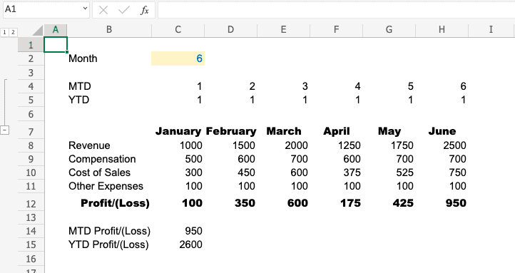
In the example below, a dynamic index, the only input field is the month which is clearly marked using a yellow background and blue font.

#2 – Create a Control Tab for Inputs
My favorite technique to organize Excel like a pro is creating a designated control tab for inputs. This takes the first concept further by creating a one-stop shop for adjustments.
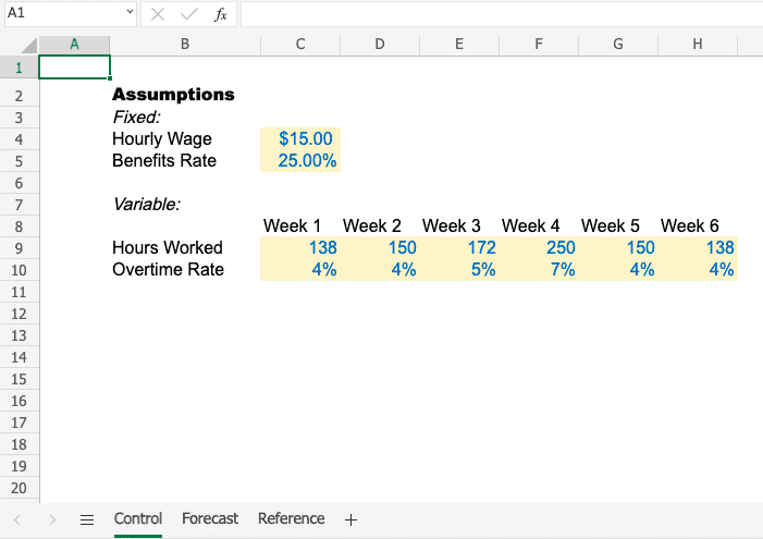
In the example below, I lifted forecasting assumptions onto a unique tab titled “Control.” All of the adjustable fields for the spreadsheet have been lifted onto this tab. You can do your work here, and then review the output and conduct analysis on separate tabs.

#3 – Organize Tabs by Type
The next strategy is to organize tabs by the type of information they contain. Additionally, you should clearly label and section the tabs. I often use the following categories:
- Input – this is where the control tab should go
- Analysis – this is where forecast models, P&Ls, and other analytics should go
- Data – Bulk data sets such as General Ledger or EMR exports
- Reference – Materials you want available but aren’t part of the analysis
In the example below, I created sections for each of these using blank tabs (Inputs->) and then organized the tabs as needed.

#4 – Reference the Original Data Point
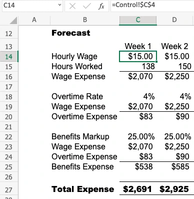
When working with complex spreadsheets, we often create cascading data points. This means we link to the nearest reference instead of the original data point. In the example below, the hourly wage in D14 is linked to C14 which is linked to the input tab.
Not only do these cascading data points slow down Excel, but they also create confusion for you and other users when troubleshooting or adjusting calculations. The best practice is always linking back to the original data point as shown in C14 below.


Formula Efficiency: Work Smarter, Not Harder
When it comes to Excel, understanding various functionalities and best practices in using an Excel formula can make them your best friends—or your worst enemies if they’re not behaving. Excel functions, like the SUM function and the IF function, can simplify complex operations by automating tasks that would typically require manual calculations. The key is to choose the right formula for the job and to simplify it wherever possible.
Choosing the Right Formula for the Job
Picking the right formula is like choosing the right tool from a toolbox. You wouldn’t use a wrench to pound in a nail, and you shouldn’t use VLOOKUP when INDEX-MATCH could do the job better.
- Understand Your Needs: Are you summing up numbers, looking for averages, or hunting down specific data points? Identify what you need before diving in.
- Know Your Formulas: Familiarize yourself with the versatile ones like SUMIF, COUNTIF, and MATCH. They can handle a lot more than they let on.
- Test Before Committing: Try your formula on a small data set to ensure it’s doing what you expect. Once it’s verified, scale it up.
Simplifying Formulas
Complex formulas might seem impressive, but simplicity often wins the day.
- Break It Down: If a formula gets too long, break it into smaller, more manageable parts. Use auxiliary columns to calculate intermediate steps.
- Use Named Ranges: As previously discussed, named ranges can simplify your formulas and make them more readable.
- Leverage Built-In Functions: Let Excel do the heavy lifting. Functions like IFERROR can handle potential errors gracefully without cluttering your formula.
Avoiding Common Formula Pitfalls
Excel formulas can sometimes feel like a tightrope walk without a net. To avoid common formula pitfalls, consider these Excel tips: double-check your cell references, use absolute and relative references appropriately, and always test your formulas with different data sets. A small mistake can cause a cascade of errors, but knowing what to watch out for can save the day.
Common Formula Errors and How to Fix Them
- Mismatched Parentheses: Keep your parentheses balanced to avoid those dreaded #REF! errors.
- Incorrect Ranges: Double-check that your formulas reference the correct cells. A misplaced click can lead to unexpected results.
- Circular References: These occur when a formula refers back to its own cell, creating a loop. Spot them by checking for Excel’s warnings and adjust your logic to break the cycle.
Real-Life Example: Debugging a Formula That Caused Chaos
Picture this: a financial report due in an hour, and the numbers just didn’t add up. Panic? Not when you’re armed with a methodical approach. I once faced a formula that spiraled out of control, throwing my entire analysis into disarray.
By breaking down the formula step-by-step and isolating each function, I tracked down a sneaky cell reference error. A quick fix later, and the report was back on track, impressing the client and saving both my sanity and reputation.
Error Checking: Keep Your Data Honest
Excel’s error-checking tools are like the spell-check for your formulas. They highlight potential errors, allowing you to address them before they become catastrophic. The tools can identify common issues such as typing errors, incorrect cell references, and formula inconsistencies.
Using Excel’s Built In Tools
- Access the Tools: Navigate to the ‘Formulas’ tab on the Ribbon. Here, you’ll find ‘Trace Precedents’ and ‘Trace Dependents,’ which help you visualize the relationships between cells.
- Trace Precedents: Select a cell with a formula and click ‘Trace Precedents.’ This will draw arrows from the cells that feed into the formula, helping you verify each input.
- Trace Dependents: Conversely, select a cell and click ‘Trace Dependents’ to see which cells are affected by its value. This is particularly useful for understanding the ripple effect of changes.
- Error Checking: Use the ‘Error Checking’ button in the same tab to review and resolve any highlighted issues in your workbook.
These tools are invaluable for quick diagnostics, ensuring your data remains as solid as your morning routine.
Manual Techniques for Spotting Mistakes
While built-in tools are great, nothing beats the human touch when it comes to spotting those elusive errors. Here are some manual techniques to ensure your data is as flawless as a well-executed presentation.
- Review in Sections: Break down your review into sections to focus on smaller sets of data. This prevents oversight and helps you catch errors that might slip through a broader review.
- Cross-Check with Peers: A fresh set of eyes can spot what you might have missed. Peer reviews can reveal errors and provide insights you hadn’t considered.
- Use Conditional Formatting: Highlight cells with specific conditions, such as values outside a defined range, to catch anomalies at a glance.
Personal Story: A Small Error, A Big Headache
Let me take you back to a day when a decimal point—or rather, the lack of it—almost derailed a major report. I once submitted a quarterly financial analysis that showed profits in the billions instead of millions. As you can imagine, that raised a few eyebrows in the boardroom. The culprit? A rogue cell with a missing decimal point.
The solution was straightforward but not before a full-blown panic ensued. By methodically reviewing each section and comparing results with previous reports, I was able to pinpoint the mistake. It was a lesson in humility and the importance of thorough error checking. Thankfully, a corrected report was swiftly delivered, and my reputation lived to fight another day.
Visualization Techniques: Make Your Data Speak
Charts and graphs are the secret sauce that turns raw data into a compelling narrative. The right visual can highlight trends, expose insights, and make your data digestible at a glance. Here’s how to ensure your visuals are not only effective but also impactful.
Guide to Choosing the Right Chart for Your Data
Selecting the appropriate chart can make all the difference in how your data is perceived:
- Bar and Column Charts: Ideal for comparing quantities. Use them when you want to highlight differences between categories.
- Line Charts: Perfect for showing trends over time. If you have time series data, this is your go-to.
- Pie Charts: Best for illustrating proportions. Keep them simple and use them sparingly to avoid clutter.
- Scatter Plots: Great for showing relationships between variables. They reveal correlations that might not be obvious otherwise.
Step-by-Step: Creating Dynamic Charts
- Select Your Data: Highlight the data range you want to visualize. Ensure your data is clean and well-organized.
- Insert a Chart: Go to the ‘Insert’ tab, choose the chart type that suits your data, and click to insert. Excel will do the heavy lifting and generate a basic chart.
- Customize the Chart: Use the ‘Chart Tools’ to add titles, labels, and legends. Customize colors to make your chart aesthetically pleasing and easy to read.
- Add Interactive Elements: For more dynamic reporting, consider adding slicers or filters. This allows users to interact with your data and view it from different angles.
By following these steps, you’ll craft visuals that not only represent your data accurately but also captivate your audience.
Advanced Visualization with PivotTables
PivotTables are the Excel equivalent of a Swiss Army knife—versatile, powerful, and indispensable. They allow you to summarize, analyze, and present data in a format that’s both flexible and informative.
Explanation of PivotTables and Their Power to Analyze Data
PivotTables transform your data, allowing you to rearrange and summarize it with ease. They enable you to quickly compare metrics, identify trends, and generate insights without altering the original dataset. Whether it’s sales figures or financial forecasts, PivotTables bring clarity to complexity.
Walkthrough: Building and Customizing PivotTables
- Select Your Data: Ensure your data is in a tabular format with headers. Highlight the range you want to analyze.
- Create a PivotTable: Go to the ‘Insert’ tab, click on ‘PivotTable,’ and choose where you want the PivotTable to appear. Excel will prompt you to drag and drop fields to the Rows, Columns, and Values areas.
- Customize Your View: Play with different configurations by dragging fields around. Use filters to refine the data displayed.
- Add Calculations: Use calculated fields to perform operations on your data directly within the PivotTable, like summing sales or calculating averages.
Case Study: Using PivotTables to Present Financial Data to Stakeholders
In a recent project, I was tasked with presenting quarterly financial data to stakeholders. The raw data was overwhelming, but a PivotTable allowed me to distill it into key metrics like revenue growth and expense percentages. By customizing fields and adding slicers, I could showcase different scenarios and insights interactively. The stakeholders were not only impressed but also engaged in a meaningful discussion about the company’s financial trajectory, thanks to the clarity provided by the PivotTable.
Formatting and Styling
Keeping styling consistent in your Excel workbook is essential for creating a professional and easy-to-use document. Consistent styling can help you to easily navigate and understand your data, making it easier to make informed decisions.
To keep styling consistent in your workbook, start by defining a standard font, color scheme, and cell style. Use these standards throughout your workbook to create a consistent look and feel. Consider using Excel’s built-in cell styles, such as the “Header” and “Data” styles, to help you create a consistent look.
Next, think about the use of blank rows and columns. Use blank rows and columns to separate your data and make it easier to read. Consider using Excel’s built-in formatting options, such as borders and shading, to help you create a consistent look.
Finally, consider using Excel’s built-in data validation and protection features to ensure that users enter data in the correct format. By keeping styling consistent in your workbook, you can ensure that your data is accurate, up-to-date, and easily accessible.
