
Step-By-Step Guide: Linear Regression Forecasting In Excel
In the heart of financial forecasting lies a superhero named Linear Regression. Don’t let the fancy name fool you. At its core, linear regression is simply a way of seeing how one thing (like sales) might change when something else (like advertising spend) changes. It’s like a crystal ball, only less mystical and more…mathematical.
And here’s the best part: you don’t need to be a math whiz to use this tool. Yes, you heard that right! If you can add two plus two, and know your way around an Excel spreadsheet (and even if you don’t, we’ll get there), you’re all set. So buckle up, folks, because we’re about to embark on a journey to conquer financial forecasting once and for all!
Key Takeaways
Linear regression is a fantastic tool for forecasting. Think of it like a crystal ball that uses math instead of magic. By studying past trends, linear regression can help you make educated guesses about the future.
Forecasting linear regression in Microsoft Excel involves creating a scatter plot of your data, adding a trendline, and using the equation of that trendline to make predictions. It’s like connecting the dots, but with a straight line that best fits your data.
What is Linear Regression?
Well, imagine you’re trying to predict the weather. You’ve noticed that the higher the temperature, the more ice cream you sell at your beachside stall. Now, wouldn’t it be great if you could use this observation to predict how many cones you’ll sell tomorrow based on the forecasted temperature? That, my friends, is linear regression in a nutshell.
In more technical terms, linear regression is like finding the best fit line through your data points. It’s like playing connect-the-dots with your data, but instead of a squiggly line, you’re drawing a neat, straight line that best represents the overall pattern. This line can then help you predict future sales.
So, if we were to put this into a practical business context, let’s say we’re looking at our ice cream sales and temperature data. With linear regression, we could draw a line through our past sales data points. The slope of this line would tell us how much our sales tend to increase with each degree rise in temperature.
And voila! With that, we could predict tomorrow’s sales based on the forecasted temperature. Pretty cool, right? And don’t worry, we’ll dive deeper into this with Excel in the next sections. Stay tuned!
Why Use Excel for Linear Regression?
First, Microsoft Excel is super user-friendly. It’s like your favorite coffee shop where you know exactly where everything is. The buttons, the functions, the layout – it’s all designed to make your life easier. And the best part? You don’t need to be a computer whiz to use it. If you can type and click with your mouse (which I’m sure you can since you’re reading this), you’re good to go.
Secondly, Excel is accurate and reliable. It’s like that friend who always shows up on time and never lets you down. When you input your data and ask Excel to perform linear regression, you can trust it to do the job correctly. It’s not going to have an off day or make silly mistakes. It’s consistent, dependable, and gives you results you can trust.
Step-by-Step Guide to Regression Analysis in Excel
Alright, team! It’s time to roll up our sleeves and dive into the exciting world of linear regression in Microsoft Excel. We’re going to walk through this process together, step by step, to forecast sales for a small business.
Make sure to download our free linear regression forecast Excel template to follow along with the examples:
Step 1: Collecting and Organizing Your Data
First things first, our regression model need data. It’s like baking – you can’t make a cake without ingredients, right? So, gather your numbers. This could be actual sales data, customer counts, temperature readings, whatever it is that you’re studying. Once you have your data, pop it into an Excel spreadsheet. Easy peasy!
Note: Remember to organize your data in two columns. One for independent variables (like temperature) and one for dependent variables (like ice cream sales).

Step 2: Plotting Your Data on a Scatter Plot
Next up, let’s visualize our data. Go to the ‘Insert’ tab and click on ‘Scatter’. Boom! You’ve got yourself a scatter plot. It’s like a starry night sky, but with data points instead of stars.
Note: To highlight your data, simply click and drag your mouse over the cells you want to include before creating the scatter plot.

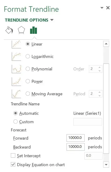
Step 3: Adding a Trendline to Your Scatter Plot
Now, this is where the magic happens. Click on one of the data points in your scatter plot, then click on ‘Add Trendline’ under the ‘Chart Design’ tab. Think of this as connecting the dots, but instead of a squiggly line, you’re drawing a straight regression line that best fits your data.
Note: Make sure to check the box that says ‘Display Equation on chart’. This will show you the equation of your trendline, which you’ll need for making predictions.
Step 4: Interpreting the Trendline and Making Predictions
Finally, let’s make some predictions. The equation on your chart represents your trendline. It’s like a secret code that can tell you what your sales might look like based on temperature. Use this equation to forecast future sales and voila! You’re now a linear regression pro.
Note: The equation will look something like y = mx + b. ‘m’ represents the slope of the line (how much sales increase per degree rise in temperature), ‘b’ is where the line starts (your base sales), and ‘y’ is what you’re trying to predict (future sales).

Real-Life Example: Forecasting Sales Using Linear Regression
Alright, friends! Enough with the theory, let’s put this into practice. I’ve got a story for you. Once upon a time (last Tuesday, to be precise), I was helping my friend, Jane, who runs a snazzy little ice cream shop downtown.
Jane was scratching her head, trying to figure out how much ice cream she should make each day. Too little, and she’d have disappointed customers. Too much, and she’d be swimming in melted ice cream (not as fun as it sounds, trust me!). So, we decided to use linear regression to forecast her sales based on temperature. And guess what? It worked like a charm! Here’s how we did it.
Step 1: Collecting and Organizing Data
Jane had been diligently recording her daily sales and the day’s highest temperature for the past year. We organized this data in an Excel spreadsheet, with one column for temperature (our independent variable) and one for sales (our dependent variable).
Step 2: Plotting Data on a Scatter Plot
We then created a scatter plot, with temperature on the x-axis and sales on the y-axis. The dots were scattered like sprinkles on one of Jane’s famous sundaes, but we could already see a pattern emerging – as the temperature increased, so did her sales!
Step 3: Adding a Trendline
Next, we added a trendline to our scatter plot. This line was like our guiding star, showing us the general direction of our data points.
Step 4: Interpreting the Trendline and Making Predictions
Finally, we used the equation of our trendline to make predictions. For instance, if the forecast said 80 degrees, Jane could plug that into the equation and get a pretty good estimate of her sales for the day. No more guessing, no more swimming in melted ice cream!
Now, I know what you’re thinking – is it really that simple? And the answer is – yes! Of course, there are always other factors at play (like that one time a bus of tourists showed up and bought all of Jane’s ice cream), but overall, this method proved to be pretty reliable.
Common Mistakes and How to Avoid Them
Alright, friends! Now that we’ve got the basics down, it’s time to put on our detective hats and dive into some common pitfalls when we perform regression analysis. These are like those pesky potholes on your morning commute – they can make your journey a little bumpy if you don’t spot them in time. But don’t worry, I’ve got some practical advice to help you navigate around them.
Mistake 1: Overlapping x-value and y-value ranges
Imagine you’re trying to make a sandwich, but instead of neatly layering your ingredients, you just throw everything together. Not very appetizing, right? The same goes for your data. If your x-value and y-value ranges overlap, your results might be a little messy. So, always make sure to keep your data organized and separate.
Mistake 2: Not factoring in inaccuracy
We all wish we could predict the future with 100% accuracy, but alas, even linear regression isn’t perfect. It’s important to remember that your forecasts are just that – forecasts. They’re not set in stone. So, always leave some wiggle room for unexpected factors (like that bus of tourists at Jane’s ice cream shop).
Mistake 3: Misunderstanding the relationship between variables
Before you start your regression analysis, take a moment to really understand your explanatory variables. Is there a functional relationship between them? Are they related at all? Remember, correlation does not imply causation. Just because two things move together doesn’t mean one is causing the other.
Mistake 4: Incorrectly plotting the line of regression
Drawing the trendline is a critical step in linear regression. It’s like drawing a map – if your line is off, you might end up in the wrong place. So, double-check your work and make sure you’re plotting the line correctly.
Mistake 5: Relying solely on Excel’s Analysis Toolpak for regression
While Excel’s Analysis Toolpak add in can be a handy tool, it’s not without its flaws. The selection and design of charts can be a bit primitive. So, consider supplementing your analysis with other tools or techniques.
Frequently Asked Questions
What is the formula for linear regression forecasting?
The linear regression equation is y = mx + b, where ‘y’ is the value you’re trying to predict, ‘m’ is the slope of the line (how much ‘y’ changes for each change in ‘x’), ‘x’ is the independent variable, and ‘b’ is the y-intercept (where the line starts).
What is the formula for forecast linear in Excel?
In Excel, you can use the FORECAST.LINEAR function to predict future values based on existing values. The syntax is FORECAST.LINEAR(x, known_y’s, known_x’s), where ‘x’ is the data point for which you want to predict a future value, ‘known_y’s’ or y values are your past dependent array, and ‘known_x’s’ or x values are your past independent array.
How to do OLS regression in Excel?
OLS (Ordinary Least Squares) regression in Excel can be done by using the LINEST function or the Data Analysis Toolpak. These tools help you find the line that minimizes the sum of the squared differences between your actual and predicted values.
How do you run a multiple regression analysis in Excel with multiple variables?
Running a multiple linear regression in Excel involves using the Data Analysis Toolpak. Just select ‘Regression’ from the list, enter your dependent variable range, and then enter your independent variable ranges. It’s like juggling, but with data.
How do you calculate R-squared in linear regression in Excel?
Calculating R-squared in linear regression in Excel can be done by adding a trendline to your scatter plot and checking the ‘Display R-squared value on chart’ box. This will give you the R-squared value, which tells you how well your line fits the data.
Have any questions on forecasting using linear regression? Are there other topics you would like us to cover? Leave a comment below and let us know! Make sure to subscribe to our Newsletter to receive exclusive financial news right to your inbox.