The Easy Guide To Self-Service Analytics
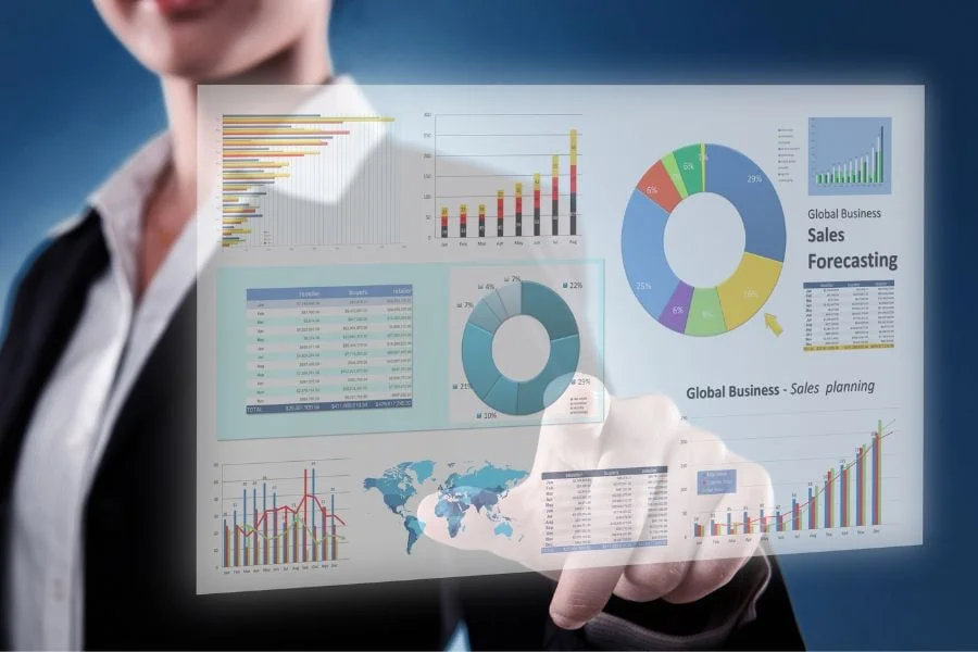
Self-service analytics is a type of business intelligence that allows business users, regardless of their technical expertise, to access and analyze data without the need for IT or data anlysts. This empowers individuals across an organization to explore data, gain insights faster, and make data-driven decisions.