
How to Create a Line Graph in Excel
Are you looking for an easy way to visualize your data? Excel is a powerful tool that can help you quickly and easily create a line graph or chart. With just a few clicks, you can turn your data into beautiful line charts that will make it easier to understand trends in your data. Plus, with the right formatting, these line graphs can be used in presentations or reports to show off your work.
You don’t have to be an expert at Excel to create great-looking line graphs – all it takes is a few simple steps. We’ll walk you through how to create them so that even beginners can start creating stunning visuals easily!
Read on now and learn how to create amazing line graphs in Excel!
What Is A Line Chart In Excel?
A line chart is a graph that looks like a line connecting data points across different categories. It’s useful for showing trends over time, such as sales figures or stock prices. Line graphs can also be used to compare two or more data sets, making it easier to spot patterns and make predictions.
Line graphs are common and effective charts because they are simple, easy to understand, and efficient. They are great for:
- Comparing lots of data all at once
- Showing changes and trends over time
- Displaying forecast data
- Highlighting outliers within a data series
When To Use Line Charts
Line charts are a great way to visualize data that changes over time. They are especially useful when you have continuous data and want to compare multiple variables or track changes in one variable over a period of time. Line charts can show trends, patterns, and relationships between multiple data sets.
When deciding whether to use a line chart or another type of chart, it is important to consider the type of data you have and the message you want to convey. For example, if you have categorical data that you want to compare, a bar chart may be more appropriate than a line chart. On the other hand, if your goal is to track changes in one variable over time, then a line chart would be the best choice.
It is also important to consider how many variables you are trying to compare simultaneously. If there are too many variables for one chart, then it may be better to break them up into multiple line graphs or convert them into an area or scatter plot instead of using a line chart.
Scatter Chart Versus Line Chart Excel
When it comes to Excel, understanding the difference between scatter charts and line charts can be a challenge. Scatter charts are best used to show the relationship between two variables, while line charts are better suited for displaying trends and patterns of data.
Scatter charts display individual data points that are unevenly distributed along the horizontal axis. The chart shows the correlation between two variables: daily rainfall and particulate values. Line graphs, on the other hand, display continuous data in a line. This is useful for showing trends over time or comparing different data sets.
Choosing the line chart styles for your data set is important to represent your findings accurately. A scatter chart is better for visualizing correlations between two variables, while line graphs work well when displaying trends or patterns over time. Both charts can be used together to tell a story with your data.
Different Types Of Line Graphs In Excel
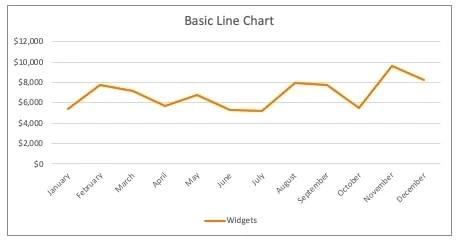
Basic Line Chart
The most commonly used type of line chart is the basic line graph, which shows a single series of data in a continuous line. This is useful for tracking changes over time and displaying trends or patterns.
Stacked Line Graph
A stacked line chart compares the variations between two or more data sets over time. This type of chart displays multiple lines that are stacked on top of each other, making it easy to compare the data and see how each set contributes to the total.

100% Stacked Line
A 100% Stacked Line graph illustrates how each data point contributes to a trend by showing each data point’s proportion relative to the total, which is 100%. This chart is suitable for data that can be arranged in a low to high order.

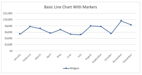
Basic Line Chart With Markers
The basic line graph is the most commonly used line chart, which shows a single data series on a single line graph. This is useful for tracking changes over time and displaying trends or patterns. This version of the chart uses markers to show the data series on the line.
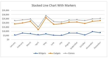
Stacked Line Graph With Markers
A stacked line chart compares the variations between two or more data sets over time. This type of chart displays a multiple line graph, with the lines stacked on top of each other, making it easy to compare the data and see how each set contributes to the total. This version of the chart uses markers to show data points on the line.
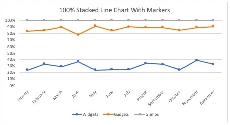
100% Stacked Line Chart With Markers
A 100% Stacked Line graph illustrates how each data point contributes to a trend by showing each data point’s proportion relative to the total, which is 100%. This chart is suitable for data that can be arranged in a low to high order. This version of the chart uses markers to show data points on the line.
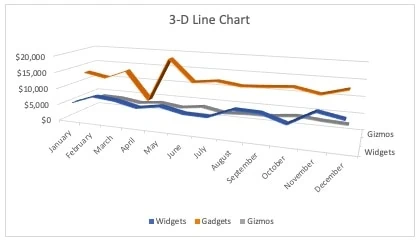
3-D Line Chart
A 3-D line chart allows you to view your data in three dimensions. It can plot trends over time or compare two data sets. This chart type may be difficult to interpret as the lines can be hard to distinguish in three dimensions.
Where To Find Line Graphs In Microsoft Excel
To find a line graph in Excel, follow these steps:
- Open a new or existing Excel workbook.
- Enter the data you want to graph into a new worksheet or select an existing one that contains data.
- Highlight the data range you want to include in the line graph.
- Click on the “Insert” tab located on the ribbon menu at the top of the screen.
- Select the line chart icon from the available chart options in the “Charts” section.
- Choose the specific line graph style you want to use from the drop-down menu under “Line.”
- The line graph will appear on the worksheet with the selected data and can be further customized with titles, labels, and other formatting options using the design and format tabs in the ribbon menu.

Alternatively, you can create a line graph using the “Recommended Charts” option under the “Insert” tab, which will provide a selection of charts based on the data you have selected.
The Chart Design Tab
The Chart Design tab in Excel is the first set of chart tools that allows you to customize the appearance of your chart, add or remove chart elements, and change the layout or style. Below are some common features available:
- Chart Type: Allows you to switch between different types of charts such as line, bar, column, pie, and more.
- Chart Layouts: Provide a selection of pre-built chart layouts that you can use as a starting point for your own chart design.
- Chart Styles: Offer a variety of color schemes and formatting options for your chart, allowing you to choose a style that best fits your data.
- Add Chart Elements: This allows you to add or remove chart elements such as a chart title, labels, legends, and gridlines to help clarify your data. Right-click on any element and click add chart element to access this pane.
- Quick Layout: This enables you to choose from different layout options for your chart, such as placing the legend above or below the chart.
- Data Table: Displays the underlying data for the chart in a separate table that can be used for reference or editing. You can also double click the chart to get to the underlying data.
- Switch Rows/Columns: This allows you to switch the rows and columns of your chart data to change the orientation of your chart.
- Add Data Labels: This allows you to show data labels at any point on the line graph
Using Chart Design in Excel, you can create professional-looking charts that effectively communicate your data to your audience.
Formatting Your Chart With the Format Tab
The Chart Formatting tab in Excel is the second set of chart tools to help you make additional modifications to the appearance of your chart beyond what is available on the Chart Design tab.
In addition to the formatting tab, if you click on the chart, a new pane will open on the right side, tailored to the chart element you selected (i.e. the format data series pane if you select one of the lines or the format chart pane if you select the entire chart). You can also access the pane by right-clicking on the chart element and selecting format (i.e. right click on a data series and click format data series or right-click on a data series and click format axis).
Below are some common features available either on the Chart Formatting tab or by clicking on the chart:
- Shape Styles: Provides a selection of shape styles for chart elements such as data markers, axis lines, and gridlines.
- WordArt Styles: You can add text boxes to your chart with various formatting options, including font style, color, size, and effects.
- Chart Title: This enables you to customize the chart title with specific font styles, colors, and sizes or to hide the title altogether.
- Axis Titles: Provides options to add titles for both the X and Y axes, with font and color formatting options.
- Data Labels: You can add labels to individual data points, series, or categories in your chart, with formatting options for font, color, and position.
- Legend Options: This enables you to customize the legend for your chart with options for placement, font styles, and color.
- Chart Background: Provides options for changing the background color or pattern of the chart area.
Using the Chart Formatting tab in Excel, you can customize your chart’s appearance to create a more polished and professional-looking final product. To learn more about formatting in Excel, check out our formatting archive.
5 Steps To Create A Line Chart In Excel
In my experience, line charts are the easiest to create, and you can do it in just five steps! Let’s walk through the process using a company’s sales revenue over time. Make sure to grab the Excel workbook below to follow along.
Excel Workbook
Step 1: Set Up The Data Set
A line graph requires two variables, one on the x-axis or horizontal axis and one on the y-axis or vertical axis. The x-axis is almost always a timeline, while the y-axis is the value you track. This could be sales (y) by month (x). Alternatively, it could be labor hours (y) by day (x). The possibilities are endless. Collect the data you want to chart from your company’s financial system or another source and set it up in Excel.
Remember that the data must be numeric values; however, they do not need to be absolute values. Line charts can display both positive values and negative values. You can always double click a chart to go straight to the underlying data.
In this example, sales revenue is the y-value, and months are the x-value. Each category under sales revenue would become its own line on a line chart. Excel can read a cleanly organized data set and understand which values are labels and which are the data.

Step 2 – Choose the chart to insert
Next, you will select the type of line charts to insert. In this case, we will select a stacked line graph with markers. First, highlight all the data that you want to include. Next, go to the insert tab on the ribbon, select line graphs, and then select stacked line chart with markers.

From there, Excel does most of the work for you. Here is the default line chart that generates once you hit the button.
Step 3 – Adjust formatting as needed
Most companies prefer a specific format for their reports. With that in mind, we can customize how this chart looks. You can change colors, the position of labels, the chart title, formatting, really anything you could normally do in Excel. Notice that the “Format Chart Area” window appears when selecting a chart or any chart element. This gives you various options beyond what is available in the ribbon. We will do the following:
- Adjust the chart title. Click on the chart title to select it. Change the title to “Sales Revenue By Month.” Bold the title by clicking ctrl+B.
- Eliminate the border around the chart so it’s easier to paste into PowerPoint. Select the chart. Go to the format chart area window. Select the border and click “No Line.”
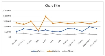
- Add a trend line to the gadgets line to normalize the outlier in April. Do this by right-clicking on the line in the chart and selecting “Add Trendline”
- Change the color scheme. Select the chart and go to the Design tab on the ribbon. Click “Change Colors” and select a pattern.
Here is the final result:

Step 4 – Sense Check The Data
Stepping away from Excel for a bit, double-check the data to make sure it makes sense. Look for trends and outliers that could be easily overlooked. This can help you spot issues like inaccurate data entry or incorrect calculations.
In this line graph, there is an outlier in April for gadgets. Does this make sense? Were you expecting this change to happen?
Step 5- Analyze And Present
Finally, it’s time to analyze the data and present your findings. Use the chart you created as a visual aid and explain what you found. For example, this line graph shows that sales were steady from January to March, with a rapid decrease in gadgets in April. The trend line shows that the sales for this month were an outlier and are not part of the overall trend. In fact, May sales rebounded well above the trend before leveling off. It looks like there was a timing issue that resolved itself.
This chart helps us visualize our data easily and provides insight into how our business performs over time. With a few clicks and some quick customization of formatting, we can make a powerful tool to help us understand our financial performance better.
Frequently Asked Questions
What Is A Line Chart Used For?
Line Charts are used to show trends over a period of time. They are commonly used in business, finance, and economics to illustrate changes in data from one time to another. The individual points on the line chart connect to show how the values changed from one point in time to another. This makes it easy for viewers to see the overall trend over a period of time.
How Do I Make A Line Graph In Excel With Two Sets Of Data?
To build a line graph in Excel with two data sets, start by selecting the two columns of data you want to plot. Then, click on the Insert tab and select Line Charts from the Charts section. Finally, click OK to generate your graph. You can also customize your chart’s appearance through the Format tab in Excel.
Can I Draw My Own Line In Excel?
You can draw your own line in Excel using the “Shapes” feature. Here’s how:
- Click on the “Insert” tab in Excel.
- Click on the “Shapes” button in the “Illustrations” section of the ribbon menu.
- Select the type of line you want to draw, such as a straight line or a curved line, from the “Lines” section of the drop-down menu.
- Click and drag your mouse on the worksheet to draw the line where you want it to appear.
- Release the mouse button when you’ve finished drawing the line.
Where Can I Learn More About Excel.
Check out our article on the best Excel Hacks! From shortcuts to tips on formatting and more, we’ve got all the best tricks for getting the most out of Excel.
If you really want to dive in, check out our list of the best Excel courses to start your learning journey.
Quick Recap
A line graph is an excellent way to visualize data. With Excel, it’s easy to create a line graph for sales revenue by month. To simplify the process, you can define the type of chart to insert – such as 2D vs. 3D, regular vs. stacked, and marked versus unmarked – to represent your data set best. Once you have defined the chart type, Excel will generate a graph of your data. You can make further adjustments to formatting, such as adding trend lines or changing colors. This will help you create visually appealing and comprehensive line graphs for your reports.
This is an ideal way to represent data and quickly analyze trends over time that would be difficult or impossible to spot if they hadn’t been visually represented.
Have any questions on how to build a line graph in Excel? Are there other topics you would like us to cover? Leave a comment below and let us know! Remember to subscribe to our Newsletter to receive exclusive financial news in your inbox.