
Pivot Table Basics
When you need to quickly calculate, summarize, and analyze data, Microsoft Excel has the perfect tool. Let’s walk through the Pivot Table Basics including setting up a data set, inserting the Pivot Table, and working with the numbers.
What is a Pivot Table?
A Pivot Table is a powerful tool to calculate, summarize, and analyze data that lets you see comparisons, patterns, and trends in your data. This feature is included with all versions of Microsoft Excel available today.
The great thing about Pivot Tables is that they are really user-friendly. Microsoft Excel will automatically generate the table and analyzing data is as easy as drag and drop. Within the table, you can filter data, run equations, and change the layout without having to rebuild the data set.
Think about Pivot Tables as a way to navigate a data set without having to manually adjust the layout or the values.
Setting Up the Data
Pivot Tables can be set up using any data set, as long as the data set has some type of row or column headers. It also helps if the data set has been cleaned up (consistent naming or master data), but you can often use a Pivot Table to see where your data is falling short.
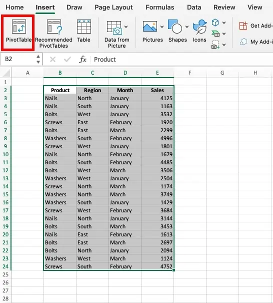
For our Pivot Table, we have a data set showing monthly sales volume. The data is organized by product type, region, and month. Overall it is a clean data set with consistent naming in each category. There are also clear column headers that Microsoft Excel will be able to pull into the Pivot Table.

Inserting the Pivot Table
Pivot Tables can be found on the left-most section of the Insert tab on the ribbon. To insert a Pivot Table, first highlight the data range that you want to be included. Then, click on Pivot Table as shown in the following image.
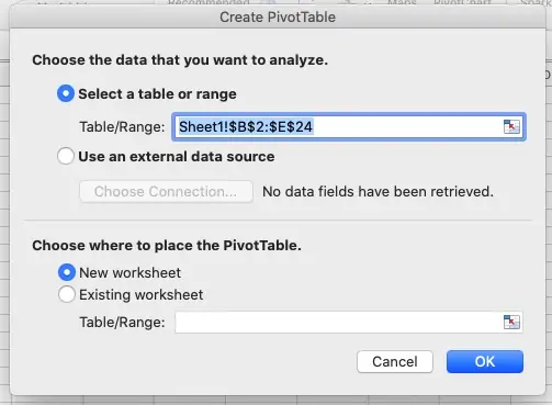
Next, the “Create Pivot Table” box will appear. First, confirm the range for data set you want to use is correct. Then, select if you want the Pivot Table to generate on the current tab or on a new tab. I recommend selecting a new tab to keep your Excel workbook organized.
Once you have confirmed the settings, hit “OK” and the Pivot Table will generate. Two additional tabs will be added to the riboon. “Pivot Table Analyze” will allow you to work with the data. “Design will allow you

Pivoting Rows and Columns
The power of Pivot Tables is the ability to quickly change views, pivoting categories between columns, rows, and values. The column or row headers from the data set will populate in the top section. You can select and drag these into columns, rows, or values. Columns will become the column header, rows the row header, and values will be the data. Within columns and rows, you can stack headers to have multiple categories and subcategories. Within values, you can run equations to sum, divide, multiply, etc.
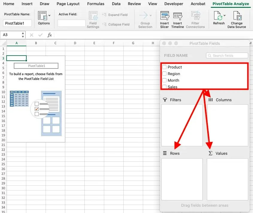
Columns will become the column header, rows the row header, and values will be the data. Within columns and rows, you can stack headers to have multiple categories and subcategories. Within values, you can run equations to sum, divide, multiply, etc.
For this example, we want to set up months as the column headers and then look at sales by region, by product. Here is how we would set that up:
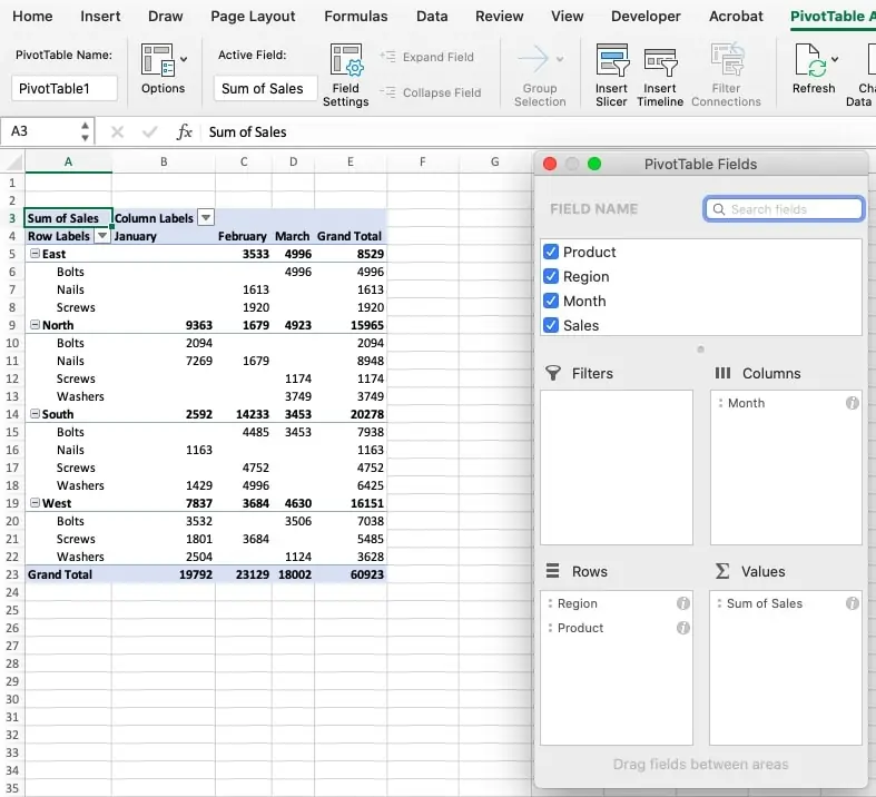
Now, let’s say we want to focus on the performance of each region. Drag region from rows to columns and drag months from columns to row below product. The Pivot Table will update automatically with your new analysis. From here, you can format the table just like any other sheet in Microsoft Excel.

Filtering Data
Another benefit of Pivot Tables is the ability to filter data within the table versus filtering the data set. This functionality is available by dragging any category into the filters box. Once the category is in the filter box, a drop-down will generate in the top left corner. You can use this to include or exclude values.
For this example, we will filter on products by dragging the product category to filers. Then we will select the drop-down in the top left and uncheck nails. Now, the sum only includes bolts, screws, and washers.

Have any questions on pivot table basics? Are there other topics you would like us to cover? Leave a comment below and let us know! Make sure to subscribe to our Newsletter to receive exclusive financial news right to your inbox.