How To Build Custom Power BI Visuals With Claude AI
Every finance team I talk to has the same Power BI problem. The reports are there. The data is connected. But the visuals look like every other Power BI report, because they are.
The CFO wants a KPI card that flips red when we’re under budget and green when we’re over. The FP&A manager wants a variance table that shows all three locations side by side, with the favorable/unfavorable logic applied correctly per metric. The controller wants a bullet chart for the board pack — the kind that shows actuals against a budget bar at a glance.
All of that is possible with custom Power BI visuals. It just requires a developer. Or it did.
There’s a workflow that changes this entirely, and almost no finance team is using it. It combines two free tools from AppSource with Claude, and it produces genuinely custom visuals without a single line of code you have to write yourself.
Here’s how it works.
What You Need Before You Start
You don’t need much. Here’s what to gather:
- Power BI Desktop — the free version works. Download from Microsoft if you don’t have it.
- An active Power BI report with at least one Actuals measure and one Budget measure already set up. The workflow works on any report structure.
- Access to Claude — claude.ai, the desktop app, or API access all work.
- HTML Viewer (free on AppSource) — a custom visual that accepts an HTML string from a DAX measure and renders it as a visual inside your report. This is the core tool.
- Deneb (free on AppSource, optional) — a second custom visual for more complex chart types. You only need this if you’re building bullet charts, waterfall charts, or small multiples.
A note on AppSource: it’s Microsoft’s marketplace for Power BI custom visuals. Both tools install in about two minutes directly from inside Power BI Desktop.
Why Power BI’s Native Visuals Run Out of Road
Power BI’s built-in visuals are solid for standard reporting. Bar charts, line charts, tables, cards — they cover most of what finance teams need day to day.
But they have hard limits. Conditional color logic at the cell level isn’t available the way finance teams actually want it. KPI cards are fixed in their layout. Bullet charts — the standard visual for showing performance against target — don’t exist natively at all.
The usual response is to export the data to Excel, format it there, and paste a screenshot into PowerPoint. Every month. Manually.
I’ve had this conversation with dozens of finance teams. The reports are connected and live, but the output that goes to the CFO is still a PPT deck built by hand. The workflow below is what finally broke that cycle for me.
The Two Tools Behind This Workflow
Before jumping into the steps, here’s the practical difference between HTML Viewer and Deneb so you know which one to reach for:
| HTML Viewer | Deneb | |
|---|---|---|
| What it accepts | An HTML string returned by a DAX measure | A Vega-Lite JSON spec (a charting format) |
| Best for | KPI cards, variance tables, custom layouts | Bullet charts, waterfall charts, small multiples |
| Claude generates | A DAX measure | A Vega-Lite JSON spec |
| Complexity | Lower | Moderate |
| Cost | Free (AppSource) | Free (AppSource) |
For most finance teams, HTML Viewer is where you start. Deneb is what you reach for when you need a proper chart type with axes, scales, reference lines, etc., rather than a custom layout.
How to Set Up HTML Viewer in 2 Minutes
- Open Power BI Desktop and your report.
- In the Visualizations pane on the right, click the three-dot icon (“…”) at the bottom.
- Click “Get more visuals” — this opens AppSource directly inside Power BI.
- Search “HTML Viewer” and look for the visual by Scherber. Click Add.
- Once installed, it appears in your Visualizations pane like any other visual.
- Drag it onto your report canvas and resize it to match your intended layout.
- In the field well on the right, you’ll see a slot called “HTML Content.” This is where your DAX measure goes.
That’s the setup. Now Claude writes what goes in that field.

Build 1: A Red/Green Variance KPI Card
This is the most common ask — a KPI card that shows the actual, the variance in dollars, the variance in percentage, and flips color based on whether you’re above or below budget.
What you need from your report
Before writing the Claude prompt, identify the exact names of your two measures — Actuals and Budget. These names go directly into the prompt.
For this walkthrough, the measures are [Sales Actuals] and [Sales Budget], pulling from a P&L with data for three locations: Astoria, Hell’s Kitchen, and Lower Manhattan.
The Claude prompt
I'm building a variance report in Power BI for a CFO dashboard. I have two DAX
measures: [Sales Actuals] and [Sales Budget]. I need a DAX measure that returns
an HTML string showing: the location name from a slicer selection, actual sales
formatted as a dollar amount, the $ variance (Actuals minus Budget), and the %
variance. If the variance is positive, show it in green. If negative, show it in
red. Use a clean card layout — white background, bold numbers, no borders.
Explain the DAX logic so I can troubleshoot if it breaks.
Three things matter in this prompt. First: “CFO dashboard” — it tells Claude this needs to look professional, not like a prototype. Second: the exact measure names in brackets — Claude uses these directly in the DAX it generates. Third: “explain the DAX logic” — this isn’t optional. If the measure breaks after you add a date filter or change your data model, you need to know what to look at.
Paste, bind, and test
- Copy the DAX measure Claude returns.
- In Power BI, go to the Modeling tab and click “New Measure.”
- Paste the DAX into the formula bar and press Enter.
- Click on your HTML Viewer visual.
- Drag your new measure into the “HTML Content” field well.
- Add a Location slicer to the page.
- Select Astoria — the card should show green (above budget in May).
- Switch to Lower Manhattan — the card should flip red (below budget).
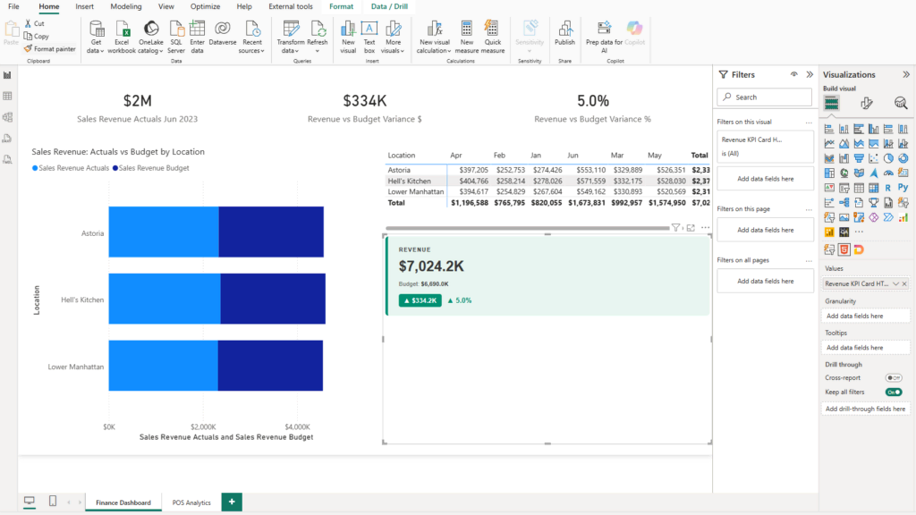
The moment that matters: watching the card flip color when you change the slicer. That’s the CFO card your finance team has been copying into PowerPoint every month, except now it lives in Power BI and updates automatically when the data refreshes.
Case Study
The Situation: An FP&A manager at a regional retail company was spending 45 minutes every month reformatting a KPI summary table in PowerPoint before the leadership deck. The data came from Power BI, but the conditional color formatting wasn’t possible in the native visual, so she exported, formatted manually, and pasted.
What Changed: She built the KPI card using this workflow during a Friday afternoon. One Claude prompt, one DAX measure, one HTML Viewer visual.
The Result: The manual PowerPoint step is gone. The card lives in the Power BI report, colors update when actuals refresh, and the leadership deck now pulls directly from the live report. 45 minutes back every month.
Build 2: A Multi-Location Variance Table With Inline Logic
A single-location KPI card is useful. A full variance table showing every location side by side — with different favorable/unfavorable rules per metric — is what finance teams actually bring to management reviews.
This is where the finance nuance in your prompt becomes critical.
Why the prompt is different here
Sales variance is favorable when positive. Labor variance is favorable when negative — lower spend than budget is the good outcome. Power BI has no way to know this. Claude does, but only if you tell it.
If you leave out that detail, you’ll get a table where labor variances are colored the wrong way. The table will look right until someone notices that the green cells are the ones where you overspent on staffing.
The prompt
I'm building a monthly variance report in Power BI for 3 locations: Astoria,
Hell's Kitchen, and Lower Manhattan. I have these DAX measures: [Sales Actuals],
[Sales Budget], [Labor Actuals], [Labor Budget]. I need a DAX measure that
returns an HTML table showing each location as a row, with columns for:
Sales Actual, Sales Budget, Sales Variance ($), Sales Variance (%), Labor Actual,
Labor Budget, Labor Variance ($), Labor Variance (%). Color the variance columns
green if favorable, red if unfavorable. Sales variance is favorable when positive.
Labor variance is favorable when negative (lower spend is better). Make the table
clean — alternating row shading, no heavy borders. Explain the CONCATENATEX
logic you use to build the row structure.
Key insight: The favorable/unfavorable direction is different for every P&L line. Revenue variances are favorable when positive. Cost variances are favorable when negative. If you’re building a table with multiple metrics, specify the direction for each one in your prompt. Claude handles it — but it needs to know.
What Claude builds here
The DAX measure Claude returns uses a function called CONCATENATEX — Power BI’s formula language has this built in — to loop through your location table, build an HTML row for each location, and stitch them into a single string the HTML Viewer renders as a complete table.

You don’t need to understand how to write that from scratch. But when the table stops updating correctly after you add a filter, knowing that it’s building row-by-row tells you where to ask Claude to look.
Build 3: A Bullet Chart With Deneb
Bullet charts are the standard visual for showing performance against target. One bar for actuals, a reference line or bar for budget, a quick read on where you stand. Finance textbooks use them. Management consultants use them. Power BI doesn’t ship with one.
Deneb fixes this. It’s a different rendering engine than HTML Viewer — instead of HTML strings, it accepts Vega-Lite (an open-source charting format) and renders real chart types with proper axes, scales, and legends.
When to use Deneb instead of HTML Viewer
Use HTML Viewer when you want layout control — a specific card design, a formatted table, a custom visual that looks exactly a certain way. Use Deneb when you want a proper chart type — bullet charts, waterfall charts, small multiples — where the chart structure itself is the point.
Setup
Install Deneb the same way you installed HTML Viewer: the three-dot icon in the Visualizations pane → Get more visuals → search “Deneb” → Add.
Once installed, drag it onto your canvas and add your data fields to the field well: your Actuals value, Budget value, and the category field (Location, in this case).
The prompt
I'm using the Deneb custom visual in Power BI with Vega-Lite. I want to build
a horizontal bullet chart showing Sales Actuals vs. Sales Budget for 3 locations:
Astoria, Hell's Kitchen, and Lower Manhattan. The chart should show the budget
as a background bar in light gray, the actual as a darker foreground bar, and
a thin vertical reference line at the budget value. Use the field names exactly
as I name them: 'Sales Actuals' for the actual value, 'Sales Budget' for the
target, 'Location' for the category. Output only the Vega-Lite JSON spec.
One critical detail: “Use the field names exactly as I name them.” Vega-Lite references your Power BI fields by name. If Claude guesses and gets the name slightly wrong, the chart renders blank. Always match the exact field names from your model.
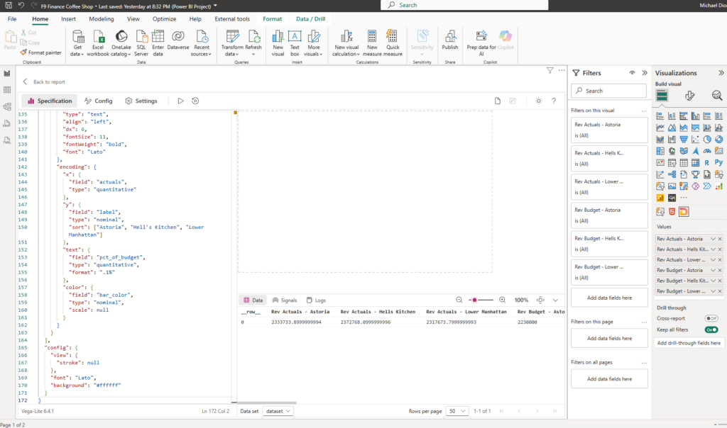
Paste the JSON Claude returns into Deneb’s Specification panel (click the pencil/Edit icon), then click Apply. The bullet chart renders immediately.

Case Study
The Situation: A controller at a manufacturing company was building the monthly board pack manually in PowerPoint. The budget vs. actual section was a formatted table — no visualization, just numbers in cells — because no one knew how to build a bullet chart in Power BI.
What Changed: Used this workflow to build a three-location bullet chart in Deneb. One Claude prompt, one paste, one Apply click.
The Result: The bullet chart now lives in the live Power BI report. When actuals refresh, the chart updates. The manual PowerPoint table is gone. Board pack prep dropped from two hours to 20 minutes.
How to Prompt Claude For Custom Power BI Visuals
The quality of what Claude produces depends almost entirely on the specificity of what you ask for. Here are the four things that matter most:
- Lead with the finance context. Tell Claude who is reading this report and what it’s for. “CFO dashboard” and “monthly board pack” produce different visual decisions than “internal review.”
- Name your exact measures. Don’t say “my actuals measure” — say
[Sales Actuals]. Claude puts the measure name directly into the DAX or Vega-Lite spec it generates. Wrong name means it doesn’t work. - Describe the behavior, not just the appearance. “Red if negative” is behavior. “I want colors” is appearance. Claude needs the logic, not the aesthetic.
- Ask Claude to explain what it built. This is the single most useful habit. When something breaks — and it will, eventually — you need enough context to ask the right follow-up question.
The cross-filtering gotcha: If you need the HTML Viewer visual to cross-filter other visuals on the same page — clicking on the card updates a chart elsewhere — say so upfront. That requires extra DAX logic and Claude can handle it, but only if it’s part of the original request. Adding it afterward is a bigger fix than including it at the start.
What This Workflow Won’t Handle
| Limitation | What to do |
|---|---|
| Cross-filtering between visuals requires extra DAX | Include in the original Claude prompt |
| CSS may render differently in Power BI Service vs. Desktop | Ask Claude to use inline styles only |
| Very complex animations or real-time streaming visuals | Use a TypeScript custom visual instead |
| Vega-Lite field names must match your model exactly | Always specify exact field names in the Deneb prompt |
| Claude can’t see your Power BI model | You have to describe your measures and fields — it can’t infer them |
How To Build This Yourself
- Open Power BI Desktop with a report that has at least one Actuals and one Budget measure.
- Install HTML Viewer from AppSource (three-dot icon → Get more visuals → search HTML Viewer).
- Drag HTML Viewer onto your canvas.
- Open Claude. Write your prompt — finance context, exact measure names, color logic, “explain the DAX.”
- Copy the DAX measure Claude returns.
- In Power BI: Modeling tab → New Measure → paste → Enter.
- Click on the HTML Viewer visual and drag your new measure into the HTML Content field.
- Add a slicer if your visual needs context filtering.
- Test it. If it doesn’t look right, copy Claude’s DAX back into a new conversation and describe what’s off.
Most finance pros get a working visual on the first or second iteration. The prompt structure is the skill. Once you have it, the iteration is fast.
The developer queue for custom visuals was always the bottleneck. This removes it.